The following is excerpted from Ed Ruscha / Now Then: A Retrospective, published by The Museum of Modern Art to accompany a new exhibition of the artist’s work . It was republished here with permission from MoMA.
——–
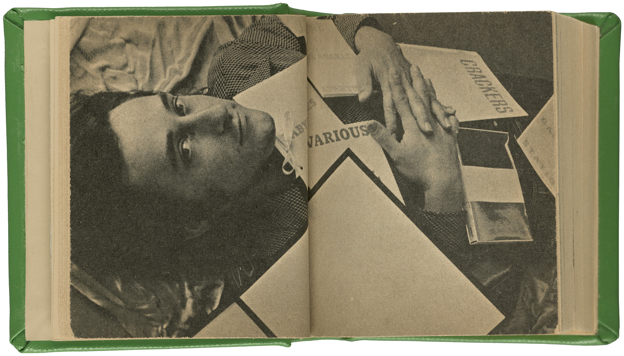
A handsome man reclines on satin sheets, flirting with the camera like a centerfold model. Books cover his chest like rose petals. The volumes, which include Twentysix Gasoline Stations (1963, Various Small Fires and Milk (1964), and Some Los Angeles Apartments (1965), form a central plotline in the story of Edward Ruscha, consummating his relationship with commerce, performance, print, and self-promotion.
This cheeky photograph fills a double-page spread in Edward Ruscha (Ed-Werd Rew-Shay) Young Artist (1972), a palm-sized book with a bright green cover, published by the Minneapolis Institute of Arts on the occasion of Ruscha’s first major solo museum exhibition. Featured within are paintings, drawings, and books as well as snapshots of the Young Artist’s life. A photograph shot from a car shows a road trip from Oklahoma City to Los Angeles. A 1967 ad that Ruscha placed in Artforum—announcing his marriage—shows the Young Artist spooning in bed between two women. Young Artist plays with Ruscha’s own self-making as his multiple roles converge—Pop artist, Conceptual artist, graphic designer, photographer, publisher, prankster, self-promoter, and affable leading man in the contemporary art scene.1 The Young Artist, now in his mid-thirties, was no longer entirely young. He was already a husband, father, and art star, well on his way to attaining fame and fortune.
Young Artist also tinkers with the etiquette of museum publishing. Smaller than a box of Cracker Jack, the little green book was both a work of art and a souvenir for sale in the gift shop. Ruscha copied its format from a beloved children’s series called Big LittleBooks, published from 1932 into the 1960s. Constructed with chubby spines, small pages, and bright covers, these illustrated books were printed on soft, cheap paper and typeset in Century Expanded, a favorite for children’s publishing. The toylike format of Ruscha’s big little monograph undercuts the mighty feat of landing a museum show. Adding another note of humor is a business card tucked into the front of the book, sounding out the artist’s frequently bungled name: ED-WERD REW-SHAY.
Ruscha’s self-authored chronology in Young Artist documents such momentous events as receiving his First Holy Communion (1945), getting his first car (1953), and publishing his first book, Twentysix Gasoline Stations (1963). That modest volume—the only work of art mentioned by name in the chronology—represented a turning point in the Young Artist’s journey. The idea for the book came to him in a dream, he said. Ruscha liked the sound of twenty-six and gasoline. He also liked what happened when he set those words in type: “If you look at the book you will see how well the typography works—I worked on all that before I took the photographs.”2 The title was an empty tank to fill with the required number of images, shot along the road between Oklahoma City and Los Angeles.
Omitting the hyphen from twenty-six is no mere spelling error. No one likes a hyphen, especially not graphic designers. Skipping it hardens the word and holds it together. Yet the title overall breaks apart: the three lines of type drift to the top, middle, and bottom of the book’s cover, creating a tenuous field that ignores the laws of gestalt unity. Ruscha applied this approach to four other books in the 1960s, creating an implied series. On a trip to Europe in 1961, he had seen simple books branded with direct, unfussy typography: “The books themselves were very distinctive, compared to anything American-made. They had some sort of odd, noncommercial look . . . a strange kind of sober design, including the typography and the binding and everything, so it was not the world of fine books that I was introduced to in Europe so much as just the stuff on the street.”3
Ruscha’s 1960s book covers flouted the rules the artist would have learned at Chouinard Art Institute (now California Institute Of Arts, or CalArts) in Los Angeles, where he studied painting and advertising design from 1956 to 1960. The design program taught a mix of Bauhaus aesthetics and Madison Avenue commercialism. The school supplied labor to Disney and the city’s print and media industries. Ruscha was an earnest, hardworking student, both exploring and questioning the conventions of art and design taught at the time.4 At Chouinard, he was the editor ofOrb(page 227), a student magazine that employed the expressive pasteup methods of Dada and Futurist collage and lampooned art and design pedagogy.
Design programs in the 1950s taught artists how to work with commercial printing and typesetting services. Today, anyone with a digital device can choose fonts and mix them with images. Before 1990, however, designers had to prepare detailed plans for typographers and printers to implement. Preparatory drawing for print—called layouts—ranged from casual roughs to tightly rendered comprehensives, or comps. In letterpress printing, type-setters and compositors interpreted designers’ layouts to create fully composed lockups. Offset printing, which was on the rise in the 1950s and ’60s, required pasteups (also called mechanicals or keylines) that were created after layouts had been approved. To make a pasteup, a designer or production artist would glue type-set galleys, images, and other elements onto a board with hot wax or rubber cement. The printer then photographed these boards to create printing pages. Books about the art of layout explore dynamic asymmetry via diagrams and virtuoso pencil drawings. W. A. Dwiggins’s book Layout in Advertising (1928) maps out the invisible “optical” lines that pull scattered images and headlines into balance. Layout sketches drained of content appeared in lavishly produced books like Douglas McMurtrie’s Modern Typography and Layout (1929) or in snappy manuals like Don May’s 101 Roughs (1942). These archetypes have an abstract beauty that is missing from the banal advertisements they ultimately generated (fig. 1).
That banality was under fire by the time Ruscha was studying at Chouinard. An alternative approach was promoted by charismatic “advertising men” in the style of Don Draper. Called the “New Advertising,” this approach blended scientific research with dry wit. One well-known ad man quipped in 1963, “Most of the artschools which train unsuspecting students for careers in advertising . . . hold that the success of an advertisement depends on such things as ‘balance,’ ‘movement,’ and ‘design.’ But can they prove it?”5 Dynamic formalism was out. Consumer psychology, market testing, and clever copy were in.
The ads Ruscha ran in Artforum in the 1960s exemplify the sexy self-awareness of the New Advertising. In one ad, a glamorous woman pulls a Chevron credit card from the décolletage of her little black dress. Text appears only on the card: service-station branding and the artist’s name and gallery. Celebrating sex, gas, and money in a symmetrical layout, Ruscha’s ad stands out from the mismatched array of gallery notices on the opposite page.6
Printers have always handled words as things. Letterpress printing, which Ruscha learned as an apprentice at Plantin Press, is the physical arrangement of solid blocks of type and spacing material.7 In the 1950s and ’60s, few designers were setting their own type. Working with professional typesetters, they marked up manuscripts with fonts, sizes, and line lengths. The typesetter sent back paper galleys to be cut up and glued down to the paste-up board. Designers could order a short text over the phone, as Ruscha did when he called in his poster design for his first big group exhibition, New Painting of Common Objects (1962) at the Pasadena Art Museum near Los Angeles.
Ordering galleys from a typesetter was costly and cumbersome. As an alternative, modern designers—from Aleksandr Rodchenko in the 1920s to Herb Lubalin in the ’60s and ’70s—created reproduction-quality lettering for their pasteups, made by hand with pen, ink, and brush. Ruscha’s professional lettering skills impart typographic precision to his paintings and drawings, which at the time were dominated by words. He liked their sounds and shapes. Meaning was secondary. In addition to copying existing typefaces such as Futura and Stymie, he designed his own lettering style, fondly called Boy Scout Utility Modern, whose awkward proportions and straight lines imitate the amateur graphics of a well-meaning office worker.8
Ruscha made his most influential books, paintings, drawings, and prints during the first dozen or so years of his career. During this period, he was working on and off as a graphic designer. He served as a layout artist at Carson/Roberts, the largest ad agency in Los Angeles, for six months in 1961 and then picked up freelance work from various clients. In 1965, he started doing layouts and pasteups for Artforum magazine, whose office was upstairs from Ferus gallery. His pseudonym at the magazine, Eddie Russia, helped separate his art career from his design work. Once a month, Ruscha made a dummy of the magazine—a complete set of layouts taped together—and then produced pasteups for the printer. This back-office labor was hardly the stuff of expense accounts and martini lunches, but the pay was good. Publisher Charles Cowles claimed that Ruscha and the secretary earned more at Artforum than anyone else, himself included.9
While most covers for Artforum feature reproductions of paintings and sculptures, Ruscha staged ambitious cover art for an issue on Surrealism in September 1966. To make the image, he spelled out the word surrealism with wooden letters and set them on a piece of glass. He bathed this assemblage in soap bubbles and lit it from below with colored lights. At the time, design-forward magazines such as Esquire and Playboy often commissioned conceptual, art-directed cover photography. Inside the magazine, the cover credit reads like a caption for a work of art, complete with the materials used and Ruscha’s legal name. A few inches below, the masthead reads, “Production: Eddie Russia.”
While Ruscha’s paintings tied him to Pop, his books landed him in the early history of both Conceptual art and the artists’ books movement. In an influential 1973 exhibition catalogue, John Perrault characterized artists’ books as “practical and democratic” works that “do not cost as much as prints” and are “portable, personal, and if need be, disposable.”10 That same year, Lucy Lippard published Six Years, a bibliographic scrapbook that documents the formative years of Conceptual art (1966–72). “The idea is paramount and the material form is secondary,” she wrote of this new genre, “lightweight, ephemeral, cheap, unpretentious.”11 Printing in the postwar period was more or less accessible to anyone with a message, and artists found ways to seize the means of production. Typewriters and mimeograph machines were ubiquitous, and small-scale commercial offset printers flourished in towns and cities.
Aspiring self-publishers quickly ran up against basic economics, however: high production costs, limited distribution, and low demand. Producing affordable multiples depended then (and to a lesser degree, now) on large print runs: the more copies, the lower the unit cost. Ruscha relished seeing the four hundred copies of Twentysix Gasoline Stations comprising the book’s first edition, but he did not relish the high unit cost tied to such a small print run—more than a dollar per copy.12 In the midst of producing his canonical books, Ruscha bemoaned his dilemma: “I’m losing money as a publisher. . . . I could print a hundred books each and sell them at $50 a piece as great works of art. But I don’t want to do that. I want to get the price down, so everyone can afford one. I want to be the Henry Ford of book making.”13 At the same time, he faced a common inventory-management problem: “‘a book in everyone’s garage’ . . . storage problems after all where am I going to park all my cars?”14
Ruscha ordered three thousand copies for the third edition of Twentysix Gasoline Stations in 1969, cutting the unit cost in half.15 This run demanded an even bigger up-front investment. At the time, Ruscha acknowledged that “as a normal, commercial project most people couldn’t afford to print books like this.”16 Then and now, printing a book costs a lot more than making a painting.17 Ruscha enjoyed the irony of investing heavily in his seemingly offhand publications: “I like the idea of spending $2,000 on something that’s just totally frivolous and spontaneous.”18
Once a book was printed, artists had to grapple with distribution. Ruscha sold copies of the first edition of Twentysix Gasoline Stations for three dollars each.19 (At the time, a prestige paperback cost around a dollar.)20 He sold or gave away copies to friends, other artists (Andy Warhol, Bruce Nauman), and curators (Betty Asher, Kynaston McShine, Kasper König). While mainstream booksellers were skeptical, he managed to sell some copies through the Los Angeles County Museum of Art bookstore and Wittenborn Art Books in New York, two of the few shops that embraced artists’ publishing. Ruscha sold copies to the Sunset Strip Chamber of Commerce and went global via airmail.21 He found an audience, leading to multiple editions and bigger print runs. Business Cards, a hand-finished collaboration with Billy Al Bengston, was published in a smaller edition and sold for ten dollars in 1968, a little less than the twelve-dollar average cost of a hardcover art book.22
Most artists had more trouble distributing their self-published works, let alone turning them into career gold. Eighteen months into producing three photographic books, artist Marcia Resnick “resigned as my own distributor,” tired of wary book stores and consignment-only deals.23 Lippard imagined seeing feminist artists’ books in school libraries and gynecologists’ offices or tucked inside boxes of Girl Scout Cookies, but she also recognized that “the content of most [artists’ books] hasn’t caught up to the accessibility of the form.”24 Creators of these multiples hoped to reach a wide audience, yet the material often failed to spark much interest, even within the art world. Artforum editor Philip Leider believed Twentysix Gasoline Stations was “doomed to oblivion.”25 Print materials created by many now-canonical artists, including Ruscha, first entered the Museum of Modern Art through the back door of the library; some were later accessioned into curatorial collections.
Ruscha leveraged various small books into large contributions to postwar art. Production by Eddie Russia subsidized the art of Ed-werd Rew-shay. By not taking himself too seriously, Ruscha became a serious artist. He used words as the subject matter of his paintings and drawings, and he mobilized print as a medium of authorship and self-fashioning. His books were significant in part because they were affordable yet producing them required knowledge and capital. The apparent lightness of Ruscha’s books understates the heavy industry they relied on.
Excerpted from Ed Ruscha / Now Then: A Retrospective, published by The Museum of Modern Art to accompany a new exhibition of the artist’s work. It was republished here with permission from MoMA.
(Hero image: Opening Spread from Edward Ruscha (Ed-Werd Rew-Shay) Young Artist (Minneapolis Institute of Arts, 1972). Courtesy MoMA.)
-
For more on Ruscha’s self-fashioning, including his cultivation of a “playboy” image, see Alexandra Schwartz, “Ferus Stud,” in Ed Ruscha’s Los Angeles (Cambridge: MIT Press, 2010), 163–234. ↩
-
John Coplans, “Concerning ‘Various Small Fires’: Edward Ruscha Discusses His Perplexing Publications,” in Edward Ruscha, Leave Any Information at the Signal: Writings, Interviews, Bits, Pages, ed. Alexandra Schwartz (Cambridge, MA: October / MIT Press, 2002), 23. Originally published in Artforum 3, no. 5 (February 1965), 24–25. ↩
-
Quoted in Clive Phillpot, “Sixteen Books and Then Some,” Edward Ruscha__: Editions 1959–1999 Catalogue Raisonné (Minneapolis: Walker Art Center, 1999), 59. ↩
-
Jennifer Quick, Back to the Drawing Board: Ed Ruscha, Art, and Design in the 1960s (New Haven, CT: Yale University Press, 2022). ↩
-
David Ogilvy, Confessions of an Advertising Man (1963; repr., New York: Atheneum, 1985), 121. ↩
-
“Edward J Ruscha, Ferus Gallery,” Artforum 3, no. 1 (September 1964), n.p. Ruscha did not design the ad himself, according to the artist’s studio, but he did approve it and may have offered input during the design process. ↩
-
Benoît Buquet, Art and Graphic Design: George Maciunas__, Ed Ruscha, and Sheila Levrant de Bretteville (New Haven, CT: Yale University Press, 2021), 80. ↩
-
Ed Ruscha: 4 Decades, dir. Michael Blackwood (Michael Blackwood Productions, 2004), video, 57 min. ↩
-
Amy Newman, Challenging Art: Artforum 1962–1974 (New York: Soho Press, 2000), 125. ↩
-
John Perrault, “Some Thoughts on Books as Art,” in Dianne Perry Vanderlip, Artists Books (Philadelphia: Moore College of Art, 1973), 21. ↩
-
Lucy Lippard, Six Years: The Dematerialization of the Art Object from 1966 to 1972 (Berkeley: University of California Press, 1973), vii. ↩
-
Invoice, Cunningham Press, May 25, 1963. Edward Ruscha Papers and Art Collection, I.A.1.3. Harry Ransom Center, The University of Texas at Austin. ↩
-
Douglas M. Davis, “From Common Scenes, Mr. Ruscha Evokes Art,” in Ruscha, Leave Any Information at the Signal, 28. Originally published in National Observer, July 28, 1969, 1. ↩
-
Studio Notebook, 1967–1969. Edward Ruscha Papers and Art Collection, II.17.10. ↩
-
Invoice, Cunningham Press, December 12, 1969. Edward Ruscha Papers and Art Collection, I.A.1.3. ↩
-
Coplans, “Concerning ‘Various Small Fires,’” 26. ↩
-
For comparison, in 1974, most tubes of oil paint cost less than a dollar; the paintings at Ruscha’s first solo show sold for $150–$400. See Utrecht Linens Finest Quality Artists’ Materials (Brooklyn: Utrecht Linens, 1974) and “Chronology,” in Edward Ruscha: Catalogue Raisonné of the Paintings__, vol.7, 2004–2011, ed. Robert Dean (New York: Gagosian; Göttingen, Germany: Steidl, 2016), 476. ↩
-
David Bourdon, “Ruscha as Publisher [Or All Booked Up],” in Ruscha, Leave Any Information at the Signal, 40. Originally published in ArtNews 71(April 1972), 32–36, 68–69. ↩
-
Advertisement for Twentysix Gasoline Stations, Artforum 2, no. 9 (March 1964), 55. The ad is featured on page 92 in the volume. ↩
-
Raymond Walters, Jr., “Paperbacks in Review,” New York Times, December 1, 1963. ↩
-
Jennifer Quick, “Pasteup Pictures: Ed Ruscha’s Every Building on the Sunset Strip,” Art Bulletin 100, no. 2 (2018), 145. The Museum of Modern Art’s copy of Business Cards includes an inscription to McShine on its cover. ↩
-
Order form for Business Cards, c. 1968. Edward Ruscha Papers and Art Collection, I.A. 2.3; and Albert N. Greco, Clara E. Rodríguez, and Robert M. Wharton, The Culture and Commerce of Publishing in the 21st Century (Stanford, CA: Stanford University Press, 2007). ↩
-
“Statements on Artists’ Books by Fifty Artists and Art Professionals Connected with the Medium,” Art-Rite, no. 14 (Winter 1976/1977), 12. ↩
-
Ibid., 10. ↩
-
Philip Leider, “Review of Twentysix Gasoline Stations by Edward Ruscha,” Artforum 11, no. 3 (September 1963), 57. ↩