The following is an adapted excerpt from The Graphic Language of Neville Brody 3, now available from Thames & Hudson.
“Technology has been absolutely key to my process and evolution,” Neville Brody says. “Each new round of technological advances brings new opportunities to explore and extend creativity. It is vital for me to be constantly experimenting, pushing boundaries, and always searching for the point where something breaks. When I find that breaking point, the challenge is then to make something new.”
Few graphic designers of Brody’s age have aligned themselves more closely with technological advances in the craft of design. An early adopter of the Apple Mac, he was also a pioneer web designer at a time when many designers recoiled from the challenge of the new medium. But he became a designer in the era just before the universal adoption of computers, and was part of the generation that could choose to embrace or reject the new digital way of working. Hard to imagine now, but it was common for designers—usually older practitioners—to dismiss the computer as a sign of graphic design’s descent into barbarism. Even prominent studios like Pentagram initially resisted the DTP revolution. Computers were for artwork, they said, not design. Brody, ever the iconoclast, embraced the digital age with evangelical zeal.
There’s not much in his pre-digital work to indicate a digital future. Early designs have an artisanal, rough-edged quality that contradicts his later adoption of high-end software and industrial-grade computing power. In his image-making, he made extensive use of the pre-digital tool kit: photocopiers, fax machines, PMT machines, sheets of Letraset and Letratone, hand-lettering and colored paper.
Once in possession of the liberating possibilities of computer-aided design, however, Brody never looked back, and nowhere is his incorporation of digital practices more apparent than in his typographic work. “I hated typography at art school,” he says, with a conviction verging on the venomous. It’s not hard to see how the young idealist might have seen the rules, constraints and dogma that surrounded typography as a creative inhibitor.
Today, all the rules and prohibitions have been breached. Radical, rule-breaking typography sits next to the traditional kind in a friendly truce. Even in the mainstream, type is routinely bent, distorted, stretched and mangled. But in the 1970s and early ’80s, it was still possible to incur the wrath of typographic puritans who regarded heterodox activity such as punk graphics, and from a slightly later period the early digital experiments of Emigre and others, as heinous acts of rebellion.
For Brody, computers brought about a typographic deathbed conversion. Typography, he realized, was the way to pursue his core interests in language, semiotics and ambiguity. It was a way to rebel against the status quo in the practice of design. It was also a way to enjoy the freedom of an artist while simultaneously acting as a communicator of cultural, political and aesthetic ideas. Freed from the doctrinaire approach to type, and armed with a set of software tools to manipulate letterforms—often to outright abstraction—typography became Brody’s chosen mode of communication. He called it Typo/graphism.
The work in these pages provides abundant evidence of his ability to push typographic expression to what he terms the “breaking point.” At first, this seems willfully obstructive. Why make it difficult for the viewer? Why be abstruse? But for Brody, adding an element of “difficulty” is a political act, a way of breaking patterns of invisible control. “We are conditioned to follow rules and conventions,” he says. “These rules are not always apparent, but they are always present and usually politically driven. Breaking these patterns is a necessary response to control mechanisms of all kinds.”
Like his hero William Burroughs, who saw language as a controlling virus and pushed grammatical and narrative forms to break free from linguistic authority, Brody also regards semantic meaning as malleable, not fixed. He stretches the meaning of words by turning them into images—or, to put it another way, he turns language into designed objects. As noted in Design Dictionary: Perspectives on Design Terminology (2008), “a designed object can be analyzed on three different levels: autonomous (as relating exclusively to its form), semantic (as relating to its symbolic meaning) and pragmatic (as relating to its function).”
The “semantic” and “pragmatic” purposes of written language are clear. The “autonomous” value of written language—its form—is less obvious, except, of course, to typographers. Traditionalists have long argued that typography should be invisible. All that matters is the message embedded in the text; if we notice the form, the typography has failed. The notion of typographic “invisibility” (which is not without value in many contexts—road signage or pharmaceutical instructions, for example) has long been swept aside. Typography is now widely accepted as having its own semiotic language—you only have to listen to the way type designers talk about the communicative properties of the typefaces they design! Brody, typically, has gone further. He has pushed typographic form into the realm of semi- and sometimes pure abstraction.
There’s a temptation to see Brody’s more abstract examples of Typo/graphism as ornamentation. The Modernists tried to eliminate ornamentation from all visual communication: it was seen as ill-suited to a new democratic industrialized world. Decoration was revived by postmodernist graphic designers in the 1990s. They took advantage of cheap reproduction techniques and the fast and easy computerized generation of graphic elements, and introduced a digital Baroque of swashes and cartouches. They made hybrid typefaces that combined serifs, sans serif and rounded terminals in a single letterform.
Brody is often linked with the postmodernists of the 1980s and ’90s. He rejects the categorization: “I have always considered myself to be a modernist,” he says. Yet, whenever any of the Po-Mo surveys mention graphic design, Brody’s name appears. And it is hard to argue that he was not one of the leaders in the deconstructionist trends of those decades.
Perhaps he is more accurately categorized as one of the pioneers of a new abstract digital primitivism. Jagged, willfully artificial, like the scrapings of a dysfunctional hard drive, Brody’s “ornamentation” is only possible with a computer. While other designers of his generation—Peter Saville, for instance, and the slightly younger Jonathan Barnbrook—produced work that was steeped in formalism, eschewing for the most part the excesses of freeform digital expression, Brody dived headlong into the digital abyss.
He rationalizes his more abstract work by asserting that the viewer necessarily has to complete the process of interpretation. “I leave things as unfixed and unfinished as possible,” he says, “to encourage a dialogue of engagement and participation.” In this, he is a Duchampian. Duchamp himself said that a work of art needed the participation of the artist and the viewer. Without the viewer, he argued, the work wasn’t complete.
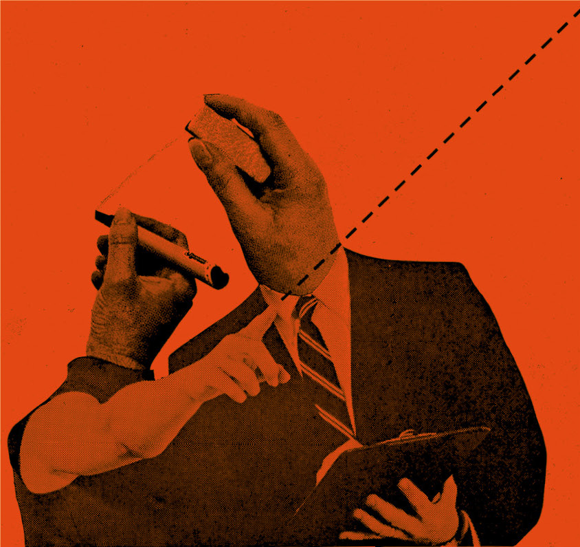
But there is something else at work in Brody’s output: the design is often the message. For a generation raised in an image-based culture, his geometric entanglements and overlapping rectilinear constructions—like architectural blueprints gone wrong—communicate with the directness of text. For a generation too distracted to read, too overwhelmed with information to concentrate, this is the new reading.
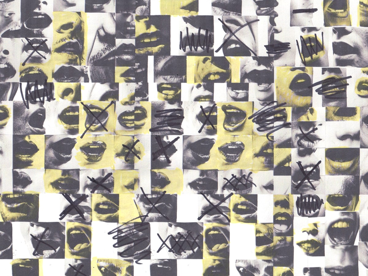
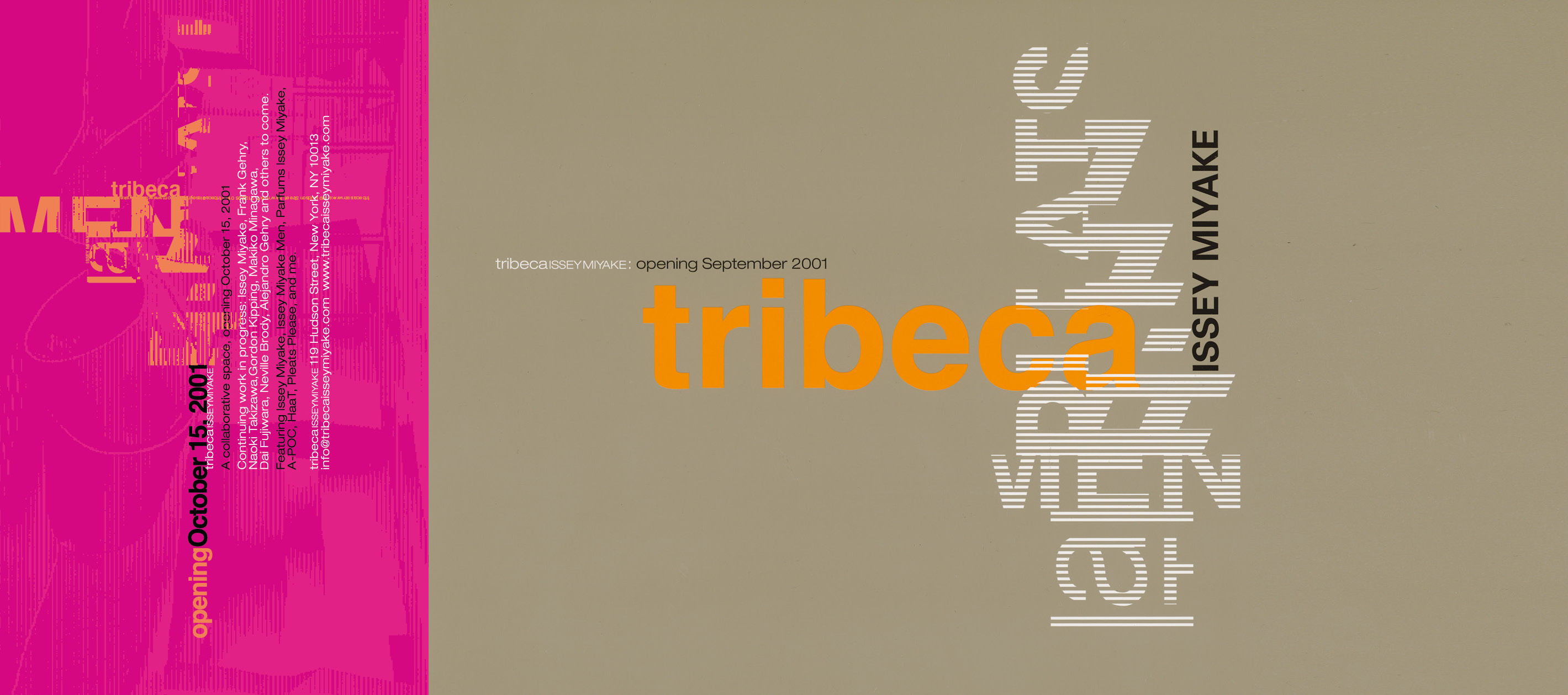
Typo/graphism also involves color. The chromatic dimension is again only made possible by digital technology. The software allows for an infinite number of colors, gradations, overlaps and highlights. Once this would have been prohibitively expensive, but in the digital terrain it is routine. Brody trades in bright, wide-awake colors. Lurid lime green sits next to hallucinatory pink. The colors are otherworldly and create a sense of mild neopsychedelic delirium.
Does Brody’s Typo/graphism merit the inclusion of the prefix “typo”? Is it typographic work in any meaningful sense? Is it the logical next step from typophoto, as pioneered by Moholy-Nagy and others? To answer these questions we need to define typography in the 21st century. The crystal goblet has long been smashed. Traditional typographic practices sit next to rule-breaking experiments. And yet today we are more dependent on written language than ever before. Our daily consumption of texts, emails, tweets, Facebook posts and a thousand other digital and non-digital sources of information are all language-dependent. Far from being superseded, typographic-based communication is enjoying a new importance. For graphic designers, or at least those dealing in the daily utilization of type and letterforms, typography has become its own lingua franca. It doesn’t matter what is being said, all that matters is how it looks. Social media feeds are saturated with typographic experimentation and hybrid letterforms, likes and dislikes are spread around like confetti.
Brody, the graphic-design student who “hated typography,” is embedded in all aspects of the typographic process. Typography is the platform, the delivery system and the voice he uses in the promulgation of his political beliefs, commercial practice and work in design education. Sometimes it is direct and its meaning unambiguous, on other occasions it revels in abstraction. Typo/graphism, in other words.
Excerpted from The Graphic Language of Neville Brody 3, by Adrian Shaughnessy, Neville Brody, Foreword by Steven Heller, Text by Jo-Ann Furniss, Text by Naomi Hirabayashi © 2023 Neville Brody Reprinted by permission of Thames & Hudson Inc.
(Hero image: Photomontage, LCP, London, 1978. © 2023 Neville Brody)