Tastes are perhaps first and foremost distastes, disgusts provoked by horror or visceral intolerance of the tastes of others.
—Pierre Bourdieu
Your father always said it’s not talent. It’s about taste.
—from the Netflix series, Beef
“Oh, they’re terrible.”
Some friends in the high school jazz band were hyped on a song by Spyro Gyra in their repertoire. Spyro Gyra? Never heard of them. But if they were jazz, Dad should know their music, right?
“The worst. Don’t listen to it.”
The Morning Dance cover art should have been the tip-off. Akin to The Lord of the Rings book cover illustrations or the Labyrinth film poster.
“No, really. Don’t listen to them. Please.”
The local cafe I frequent on weekends has moved on from playing bebop jazz to fusion. I hate fusion. Yoke the worst parts of rock and jazz together and—voila—musical virtuosity devoid of emotion, urgency, or energy. In a word: Yuck.
My father dislikes fusion, too. Miles Davis’ Kind of Blue and John Coltrane’s A Love Supreme are his twin peaks of musical expression. His distaste struck me as exhibit A of how our tastes often calcify as we age. (He doesn’t like much of the pop music I listen to either.) But this was before I listened to either bebop or fusion jazz. I understood his aversion once I did. Where the melodic lines of bebop flutter and swoop, fusion’s barely get airborne and then land with a thud.
There are many acolytes of Miles Davis’ supposed fusion landmark, Bitches Brew. I give it another try every decade or so and narcoleptic fits ensue. Am I not a patient listener anymore? Is it better stoned? (That might explain my similar revulsion of the Grateful Dead.) No, fusion is just bad. Period. Release the hounds, Headhunters fans! I won’t bend on this one, and neither will my father.
Music is often the first whetting of taste palettes. Even if these bents usually stiffen by the full pre-frontal cortex maturation of one’s mid-twenties, we still sponge up a broad range of music in those first two-plus decades of existence. Childhood naïveté prioritizes sheer joy as the key taste arbiter, so we’ll careen from artist to artist as long as the notes still stoke a fire in one’s heart. Then, a turn occurs. The music’s external associations begin to vie for attention with the internal emotion it stirs. Even the atomization of genre by streaming services can’t fully erase the tribal boundaries musical allegiances signal. Teenagers still go gaga over the latest manufactured pop group only to drop them mere months later, a relic of their now-perceived immaturity. Punk acolytes still impose litmus tests on fellow fans and bands alike. Taylor Swift may possess true artistry, but I refuse to acknowledge it in my streaming library. No collaboration with the National will change that. I know my limits.
Designers can’t help but participate in these displays and debates of taste. It’s part of the job. There’s an irony in the predominantly liberal and inclusive political leanings of most creatives that often become unbending and exclusionary in their work and everyday lives. Comic Sans, Thomas Kinkade, New Urbanism, clutter—there are too many heretical acts to count. Natalia Ilyin writes in Chasing the Perfect, “For people who want their straight lines to be straight, life itself is the problem. The modern urge is the urge to get away from organic existence in general.” No wonder most movie villains live in spartan homes of concrete, glass, and steel. The often humor-free designer is not so different, if not in evildoing, then at least in temperament.
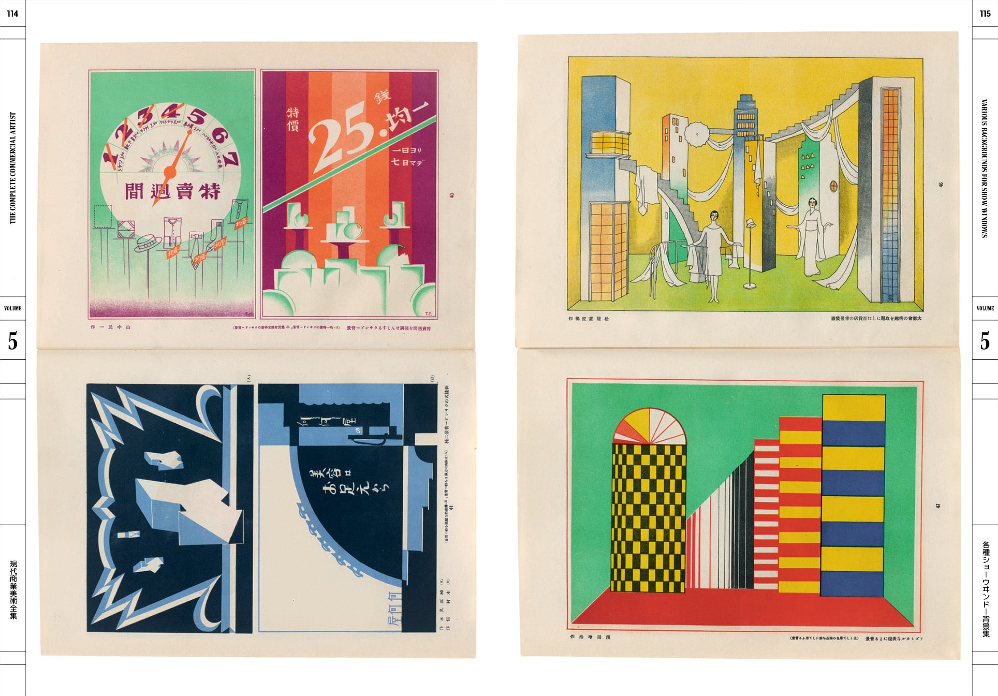
Some years ago, I was a judge for a prestigious design competition. Eight judges had to go through thousands of entries over three days. The initial culling was so fast that our knee-jerk first impressions were all that mattered. Any entry that didn’t all but bellow for attention was quickly eliminated. I suppose that grabbing our attention first and foremost is one criterion for effective communication design. But not every star student is the one who raises their hand all the time.
Case in point, one entry was an initially unassuming synagogue prayerbook. I probably wouldn’t have noticed it had I not been half-Jewish and had sat through many services with a similar book in my lap since I was a young boy. I admired the moxie of whoever had submitted the entry. In addition to its muted tone, the profile of award-winning design tends to be pretty secular and pretty Gentile. Any serious contention was a long shot at best.
The prayerbook’s cover and spine were elegantly designed—spartan serif typography, gold foil-stamped into a matte plum case wrap binding. Curious still, I flipped through the pages, revealing the most elegant—and elegantly functional—prayerbook page designs I’d ever seen. Each spread had Hebrew on the verso side, English translation on the recto, and Talmud-reminiscent notes on the outer margins of both that explained the provenance and purpose of these prayers for the different Jewish holidays. Education is central in most Jewish households, but why no one had thought to merge learning and prayer in such a manner up until now—and design it so well—was surprising. A+ for a perfect, necessary mishmash of form and content.
Alas, I was the only one to propose the prayerbook get past the first round, and the little bit of elbow-twisting I was allowed couldn’t sway the other jurors. (I also couldn’t take the book home with me, even though it had been consigned to also-ran oblivion.) Michael Bierut, in the “How to Win Graphic Design Competitions” section of his 1995 essay “How To Become Famous,” writes:
Enter only the kind of pieces that win design competitions. For the record, the kind of things that win in design competitions are cool-looking projects that solve easily understandable problems. Things that are brilliant responses to intricate marketing briefs but that can’t be understood by another designer in less than a second will not win.
If we’re not going to try to understand the project, then what is left in the judging process? As Bierut says: “cool.” What defines cool? Taste.
I can’t be the only one who has gone through the last few AIGA 50 Books / 50 Covers winners’ gallery—selections that are usually art catalogs, highbrow literature, and design books—and think that the judges are peacocking their cultural and political leanings as much as evaluating supposed “good” book design. Rob Giampietro, one of the 2023 judges, said as much at the recent AIGA national conference, remarking that if “the book didn’t have a topic that was urgent, we didn’t pick it.” Three designers get to decide what is “urgent” for everyone? Doesn’t great design for middlebrow content have value, too? There have to be some worthy entries, right? Or are they not being entered because their designers know better not to waste money on the entry fee? And which explanation is worse?
The kind of orientation in the world that I was trying to argue for, and I identify as a critic, was my picture of a democratic citizen. Acknowledging and even committed to your own experience, your own identity, your own specific situation in the world, but also partly open to the experience and the acknowledgment of other people.
—A.O. Scott
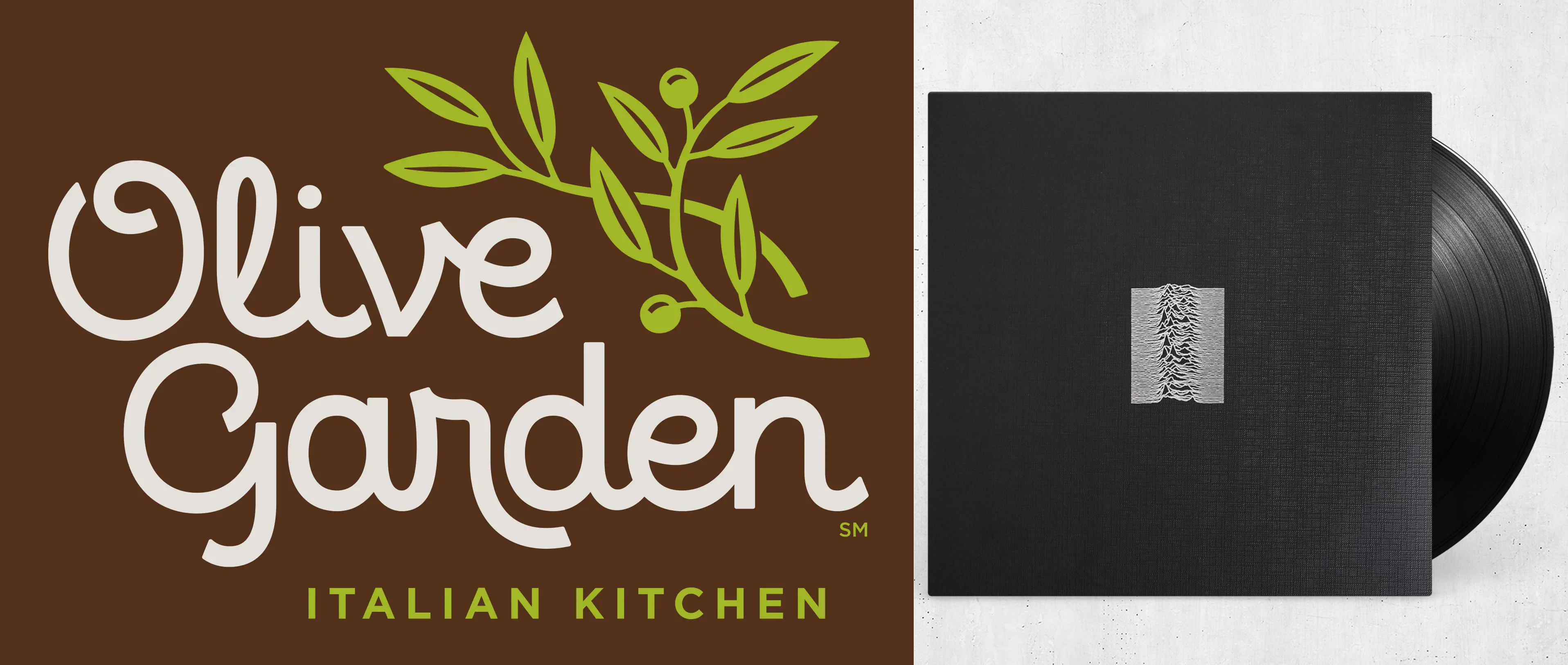
In 2014, an online design publication posted its “The Best and Worst Branding” of the year. One “Worst” pick was a rebrand of every urban food sophisticate’s bête noire, Olive Garden, and a telling case study in multiple kinds of taste.
While not a home run by the standards of the brand design establishment, the redesign is surely an improvement on the old identity and certainly more versatile for extensive use. It’s perfectly competent, maintaining the original’s friendly tone while updating it for the anti-skeuomorphic era of the twenty-tens.
But the urge to bash is too great:
At least with the old logo, you knew what it meant: bad food served in a depressing mass-produced setting…Give me the old logo any day. It told anyone who saw it, at a glance, that whatever cuisine this Olive Garden served, it would be artificial, inedible, and served to you by corporate cretins. Now that’s truth in branding.
Ouch. But is Olive Garden really the most egregious example of untruth in branding, let alone consumption spoon-fed by “corporate cretins”?
The reverence for Peter Saville’s Joy Division and New Order sleeve designs has only grown in the decades since the LPs were first released. Today, numerous Millennials and their parents alike sport t-shirts with the iconic white-on-black sound waves from Unknown Pleasures. Suppose, though, that those Closer and Blue Monday album covers were created for an also-ran new wave band that never broke through to the cultural consciousness Joy Division and New Order have today. Would those designs be so celebrated? I’m not so sure. The cachet of the content is as much a part of the story as the visuals that articulate it. Lauding these designs says as much about one’s overall cultural acumen as it does a design eye.
The thrashing of the Olive Garden rebrand has the same shades of establishing taste bona fides more than any considered design critique. Content is king—and this content is a lowly serf at best. I’d wager not even a star designer taking the Olive Garden job could craft a solution that would transcend the middle-America lowbrow trappings of a restaurant famous for all-you-can-eat breadsticks and overcooked pasta. Never mind that these celebrated design practitioners also have an image to uphold themselves, and the cuisine of the suburban hoi polloi isn’t part of their professional brand, let alone the personal one.
The branding worst-of list also included Pizza Hut, Hershey’s, and Oscar Mayer Lunchables. Sorry, too easy. We don’t expect refined branding from these companies or products. The “bad” design is at least refreshingly honest and inclusive: it tells us exactly what we’re getting here. (And wasn’t that supposedly an asset for the original Olive Garden logo?) If hypocrisy is Olive Garden’s misstep here, maybe these critics should instead be scratching at the smooth surfaces of more celebrated brands that intoxicate our taste feelers at the expense of a moral compass.
Why not target the refined branding that shapes sophisticated tastes while whitewashing the evils that often lurk behind its performative, slick sheen? When taste scrambles our ethical antennae, that’s something to be worried about. We should be wringing our hands over Uber’s single-ride emissions nightmare, Facebook’s privacy issues, Apple’s formidable e-waste, Starbucks’ assault on organized labor, and where Tiffany & Co. mine their diamonds. Not bemoaning stale bread sticks or stuffed pizza crusts. There’s also plenty of evidence our current political divide is as much based on cultural differences as economic disparity. These displays of taste have quietly become less an innocuous surface concern and subtly further cleave us apart as a society. Rather than the easy bash of a worst-branding-of-the-year clickbait listicle, might reconciling these differences be better served by focusing on the complexity of these hypocrisies instead? After all, one of the few things people from across the political spectrum predominantly agree on is that, more often than not, corporations suck. Or at least rarely have our best interests in mind, whatever feel-good bromides they parrot in the company literature and advertising. But doing that would require thinking past the shiny surfaces and, for many designers at least, nipping at the hands that feed them.
Most people lie about what they love.
—Dave Hickey
The definition of pretentiousness is pretending you get it, whatever it is.
—A.O. Scott
Psychologist Daniel Kahneman has proposed the following thought experiment: Imagine you take a vacation, and at the end, all your pictures—and, by extension, social media posts—will be destroyed. You’ll also get a drug that will make you forget the entire experience. Would you choose the same vacation? Kahneman is trying to point out the struggle between our “experiencing” and “remembering” selves and their uneven weighting, usually favoring the latter. But it’s also an implicit meditation on taste and how it warps our sense of what we want versus what we should want.
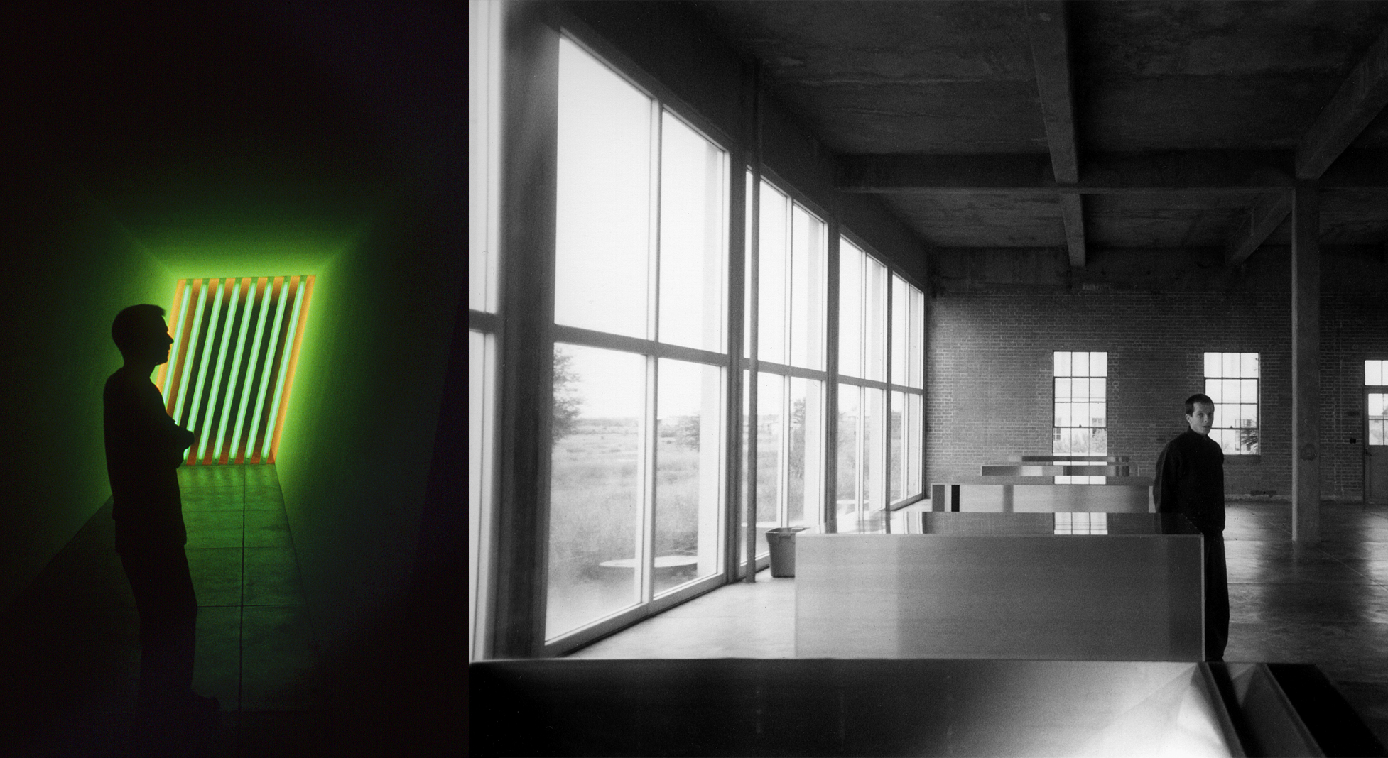
I was fortunate to visit the south Texas art mecca of Marfa in the early 2000s, before the Prada storefront, the I Love Dick television series, and the art world glitterati arrived en masse. I had only learned of its existence mere months before through my brother, who had recently relocated to El Paso, and my knowledge of Donald Judd was cursory at best. I had few expectations and little understanding of its cultural importance in rarefied circles. And I only had an SLR film camera to document it, which I barely used. I was too smitten with the place to stop and snap photos.
The Marfa experience, primarily through the Chianti Foundation locales, was one of the more profound I’ve had around art. Donald Judd’s work finally made sense, situated in the open Texas landscape rather than confined in a downtown New York gallery. Ditto for Dan Flavin’s work, so innocuous in a solo show I visited at the National Gallery in Washington D.C. a few months earlier. But I wonder if the experience was enhanced by having few expectations and the inability to share photos instantaneously through social media. Does my taste filter, both in how it enables a wary skepticism to my cultural experiences and then my ability to broadcast them instantaneously through a smartphone, too often make me unable to fully immerse myself in—and enjoy—these moments? A colleague once remarked to me, “It’s okay to love what you love,” but after decades in a career that often involves being culturally discerning, am I even sure it’s what I love in the first place?
When I was a West Coast student in the early 1990s, graphic design was reaching peak rebellion, enabled by Macintosh computers and PostScript type. Emigre was the bullhorn for a new, contrarian philosophy, and RayGun was its chief instigator on the front lines. Yes, I needed to learn the fundamentals, but defiance wafted through the classrooms. Our opinions, however arrogantly uninformed, felt on equal footing with those of our instructors. Whatever was on or off the table was up to us. When I look today at some rave flyer designs I created at my first professional gig working for a San Francisco club, I marvel at how wonderfully unmoored they were from any design doctrine I’d been exposed to up to that point (and in the three decades since). That liberation was intoxicating—and, alas, short-lived.
Now, I teach upper-level studio design courses at the same institution. My students usually already have built-in biases that, for some, have calcified into hardline rules. Font choices, process methods, and even political leanings. Which wouldn’t necessarily be bad if it didn’t often feel so safe and devoid of any fun. The prevailing inclination for me and my peers was mischief. Now, it’s fear and anxiety, and in the minds of many of my students, pledging even a brief allegiance to a soon-to-be-obsolete tool or a fleeting style could mean one more project not suitable for the portfolio and potential career oblivion.
I haven’t been immune to this logical and paradoxical retreat, either. Logical because all one has to do is read the constant newsfeed of political unrest, climate change, and economic uncertainty to get shaky in the knees, however privileged one’s perch in life. Paradoxical because one’s access to culture and the expression of it has never been easier. But at least my “table” had edges. Now, in the age of Google image search, an Alexandria-sized library of design books, and the People’s Graphic Design Archive, the buffet goes on forever, and everyone’s meal is different. More is more is—oh hell, I don’t know WHAT to do. Add these macro societal concerns, and no wonder Swiss Modernism and retro brand guidelines are so appealing to so many designers again. They have rules—and help eliminate any unnecessary distractions and decision-making that might add to the collective stress of everyday existence in 2023.
Out of all the adjectives I would use to describe this bygone era of refined design and its practitioners, “fun” wouldn’t be one of them. Henri Lefebvre writes in Toward an Architecture of Enjoyment, “[P]hilosophers…reject pleasure, enjoyment, sensuality, and physical joy,” and I’m sure those old Swiss guys saw themselves as philosophers as much as they did designers. And by extension, what is taste but also a philosophy, however personal? I wouldn’t go so far as to say that the ethos of my time in design school was to reject taste altogether. But challenging the status-style quo sure was a kick, however fleeting the moment was. And our youthful ignorance was a big part of the fun. It’s that same ignorance I brought to the Marfa visit.
Maybe that’s the biggest bummer about our social media-addled age. It’s nearly impossible to have that kind of naiveté anymore. Easy access to information coupled with the public nature of our interactions extends to how culture is produced and taste quotients are honed. It’s a supercharged, warp-speed feedback loop that one can’t help but be sucked into. That urge to share—and criticize—enables a climate of cautious performance that bends to the algorithm, both analog and digital. A dance party bereft of serendipity and joy, where everyone already knows the DJ’s playlist.
“Just let the clutch out slowly.”
“I am, I am.”
“Okay, now a little gas—“
[Stall]
“Fuck.”
“Okay, try it again. Press down the clutch, put it in first—”
[Stall]
“Fuck!”
[Laughter]
“It’s not funny!”
“It is, actually. But keep trying.”
“Shit. Do I have to?”
“If you want to drive, yes.”
My father has only owned foreign cars. Throughout my childhood, it was a series of Volkswagens—a Beetle, a Rabbit, a Jetta, and then a Scirocco. Odd, perhaps, that a Jewish man would be so enamored with German cars, but style and cachet supersede provenance, I guess. (He later moved on to Saabs and Volvos.) After selling a small soft drink bottling plant when a large conglomerate came knocking, his father treated himself to a—used, mind you—Mercedes 450SL. I want to believe my grandfather loved its design. But considering his working-class origins in a quietly antisemitic Rust Belt town, the better money is on the status the car symbolized. This Jew had arrived, WASP establishment gentry!
I have plenty of design peers who love cars to the point of perverse fetishization, at least in the mind of this avid bicycle commuter. Was I the only one who found Dieter Rams’ aspirational talk (in the recent Rams documentary) around the egalitarian nature of his design work and then the dismissal of Elon Musk and Tesla a bit rich when he zoomed off in a Porsche 911 a few scenes later? The familiar retort I often hear is, “But the design of [insert car feature here] is so great! It has nothing to do with the brand.” Really? Okay, maybe it’s complicated.
All my father’s cars were also manual transmissions. For him, knowing how to work a stick shift puts you in an elite class of motorists. If learning to drive wasn’t fraught enough for a meek teenager, gear shifting only added to the anxiety. I’ve never forgotten his weekly Saturday instruction in the local Burger King parking lot. The initial frustration of getting the car into first without stalling nearly brought me to tears. But once I finally got it? Magic. Driving was suddenly fun. There was joy in both the accomplishment and the experience. Not surprisingly, the only two cars I’ve owned over the last 30+ years are manual shifts (and foreign), doubly impractical in a city with steep hills and plenty of traffic gridlock.
While I’d never admit that my cars’ styling was immaterial to why I chose them, the intrinsic functions that enabled them as usable objects were part of the allure, too. They don’t just stay in the garage to be admired for their formal attributes alone. If anything, the relish in these moments of use makes one forget what the object signifies to onlookers. It’s the marvel I experienced discovering the prayer book while judging the design competition. It’s the transcendence a Joy Division fan feels when hearing “Love Will Tear Us Apart,” whether packaged in a Peter Saville-designed LP sleeve or on a generic Maxwell XLII 90 cassette. (Or, in today’s streaming world, neither.)
Josh Cook, a seller for an independent bookstore in Cambridge, Massachusetts, writes in his book, The Art of Libromancy, of a more “humane” version of “good taste”:
Ultimately, perhaps the biggest difference between the humane good taste I’m trying to cultivate and the weaponized good taste used as a tool of cultural authoritarianism is the latter is something you have and the former is something you do…It’s not about occupying a position of authority but about communicating what I think and what I know in ways that are impactful and evocative to other people. [Emphasis mine.]
It’s telling, admittedly, that I find Cook’s thoughts so resonant. However much my love for the visual surface of things I’m so often asked to articulate, my passion for the actual content has always meant more. It’s probably why I’m less interested in, say, fashion or furniture design because what’s still most important to me are the words between the Peter Mendelsund book covers, the music in the Peter Saville LP sleeves, the volumes stacked on the Eames shelves, the food in the Heath Ceramics bowl, and the friends and family—the “other people”—actually occupying the chairs, wearing the clothes, or in the passenger seat next to me as I try to get the car into first gear.
To cast aside the joy aspect of human existence is plain dumb.
—Kenneth Fitzgerald
Natalia Ilyin (also in Chasing the Perfect) writes of the cognitive dissonance between the tight rigor of her graduate design studies and the freewheeling improvisation of her jazz musician neighbor, Kirk, and his friends who would come over to play with him.
And at the end of a song they did the oddest thing: they laughed. They didn’t laugh because something was funny—it was as involuntary as breath. That laugh was an appreciation of all that had just happened, right then, there in Kirk’s living room, in the middle of the night. I have never heard a laugh like that go round a room of designers.
I’ve read this passage many times over the years, and it still makes me pause. How often have I scoffed dismissively at film recommendations that didn’t initially align with my taste quotient? Or winced (if not stayed away) when an otherwise fine restaurant has a poorly designed sign? Or didn’t buy a book I wanted to read because of its lackluster cover design? I often tell people in jest that design is a sickness, but the joke gets less funny as the years go on. My designer antennae aren’t protecting me from harm. They’re insulating me from potential pleasure, learning, even wisdom. And making me insufferable to be around, to boot. Why would I want that?
My father died a few months ago. I have the same regrets as anyone who loses a parent—that I didn’t spend enough time with him, didn’t say enough, didn’t give enough. There’s a tragic irony in that you often don’t fully grasp your connection to someone—and understand their influence—until that person is gone. My father didn’t talk much about his feelings. Yet his enthusiasm for the transgressive Jewishness of Portnoy’s Complaint, the films of Ingmar Bergman, the instrumental horn breaks in Stevie Wonder’s “Sir Duke,” John Coltrane’s solo in “Giant Steps,” the plays of August Wilson, ethnic food of every sauce and spice, or the Roz Chast cartoon in the latest issue of the New Yorker all spoke emotional volumes, indirectly showing his affection in one of the few ways he knew how.
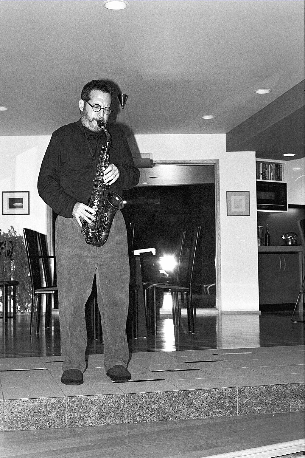
When my brother and I began writing a eulogy for the memorial service, there were enough stories for ten of them, never mind one. Despite the sad circumstances for doing so, we laughingly recounted these memories to each other, and a thread slowly emerged. Yes, my father was anxious and sometimes obsessive. He had strong opinions about everything—food, movies, cars, and, yes, fusion jazz. But these opinions were always coupled with joy. He was also an amateur jazz musician, accomplished on both clarinet and saxophone, and his own frequent and infectious laughter came from the same place as Ilyin’s musician neighbors. Jazz is often referred to as a conversation between the players, and my father saw all his cultural interactions in that way. He wanted to share his interests, not unilaterally impose his tastes. Whether he knew you all his life or for just a few hours, you were in his band, so to speak. If you want to sit in, you have a place on the bandstand.
His is the kind of “music”—design, culture, taste—I’d like to “hear” more. Even if it’s the equivalent of fusion jazz. (Maybe.)
Ronald Heiman (1942-2023)